
Where am I?
Making recruitment day-to-day simpler
After a discussion with the design team, I started investigating why our product received feedback on not being intuitive enough, having a complex onboarding process and confused navigation patterns.
The system being a B2B Enterprise product, it has robust features, several usage contexts and users with diverse goals.
The system being a B2B Enterprise product, it has robust features, several usage contexts and users with diverse goals.
Problem
In a Design Critique session, the squads brought up several problems they were facing to project features inside existing products:
• How does the user find a new feature?
• How to encourage the discovery of new features that have a low use rate?
• How to decrease the number of interactions to get to a new feature?
• The product navigation was confusing and unobjective.
This has a high cognitive impact for the user's understanding of what step is supposed to do. The hypothesis is that said problems have a great impact on the feedback received about how intuitive the product is.
Audience
Kenoby focuses on B2B Enterprises, companies with a high number of employees and high hiring rates. Our main business cornerstone stands by these four main user profiles:
• Hiring and Selection Managers
• Recuiters
• Hiring Managers
• Candidates
• Hiring and Selection Managers
• Recuiters
• Hiring Managers
• Candidates
My role
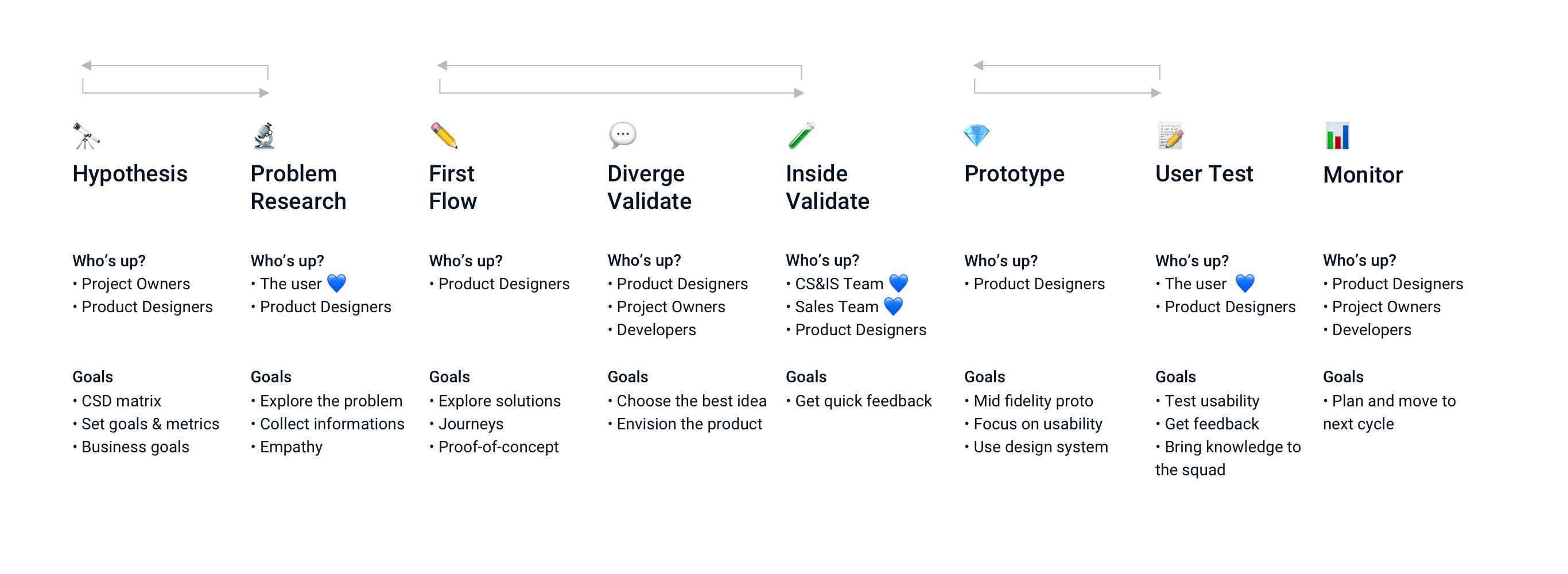
Execute the design process end-to-end with:
Research and Metrics
We started by evaluating data we had at the time and tried to be empathetic towards the users. Our main databases were:
• NPS - Analyzing qualitative feedback that had the tag "UX"
• Support team - Semi-structured interviews
• Customer Success team - Semi-structured interviews
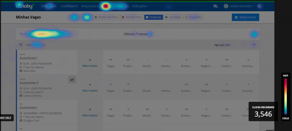
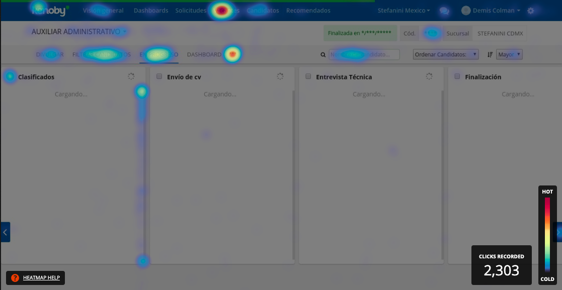
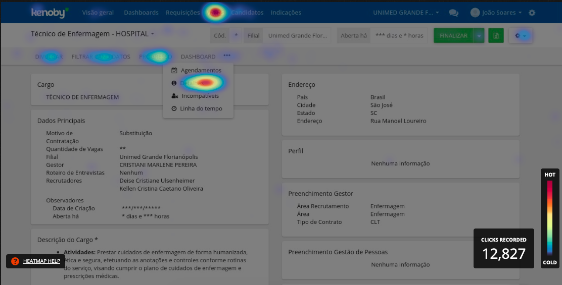
• Hotjar and Google Analytics - Heatmaps and metrics
• NPS - Analyzing qualitative feedback that had the tag "UX"
• Support team - Semi-structured interviews
• Customer Success team - Semi-structured interviews
• Hotjar and Google Analytics - Heatmaps and metrics
Heuristic Evaluation
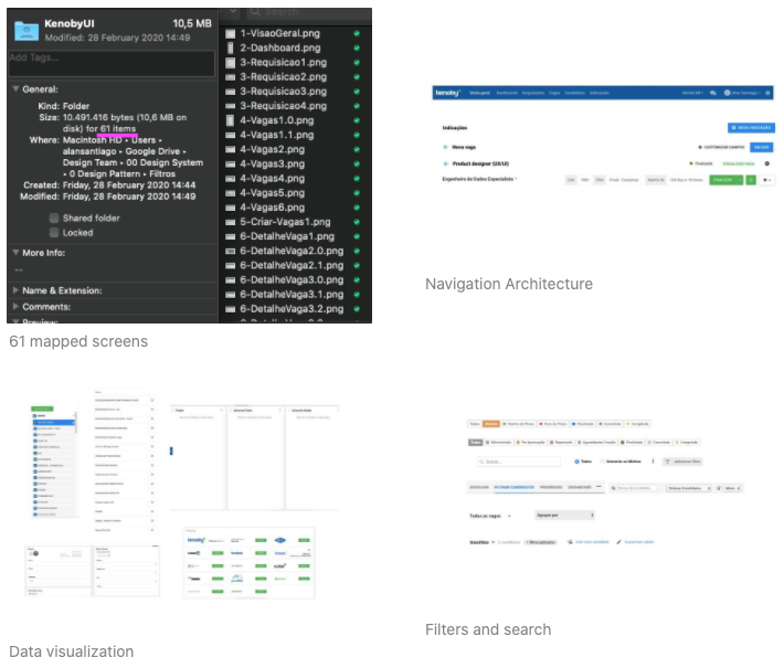
After the feedback and interviews were put together, I mapped all user interactions with the recruitment features. I printed screenshots of the whole product and, with the help of a product designer, searched for interaction patterns.
We found several inconsistencies, however we also found some patterns:
We found several inconsistencies, however we also found some patterns:
Analysing references and competitors
To further expand our knowledge, I researched for reference on tools with a high number of features, as well as on other ATSs.
• Atlassian Jira
• Dropbox for business
• Mailchimp
• Google G Suite
• Intercom
• Digital Ocean
• Lever hire
• Team Tailor
• Workable
• Breezy HR
• Atlassian Jira
• Dropbox for business
• Mailchimp
• Google G Suite
• Intercom
• Digital Ocean
• Lever hire
• Team Tailor
• Workable
• Breezy HR
Hypotheses definition
With these inputs, the product management team, client success team, design team and I got together to discuss and define hypotheses:
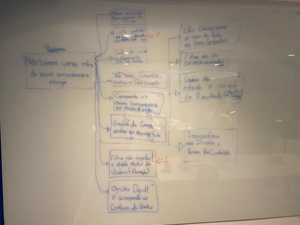
Possible main problems
• Too much inconsistency in navigation (navigation bars, filters, etc.)
• Filters have inconsistent appearance and position on screen
• Filters do not follow the user's mind map
• Filters have inconsistent appearance and position on screen
• Filters do not follow the user's mind map
Fast prototyping
We believed that the several positions in which filters appeared on screen made the navigation confused and got in the way of users to accomplish tasks.
Based on our research, I explored numerous paths to solve the problem.
Based on our research, I explored numerous paths to solve the problem.
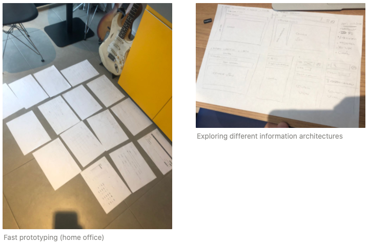
From this exploratory exercise, I reached the ideal information architecture for our products.
This would prove to be essential to create new interfaces, with no complexity increase and also decrease the user's learning curve.
This would prove to be essential to create new interfaces, with no complexity increase and also decrease the user's learning curve.
Design pattern prototyping
Kenoby's design pattern is a set of principles necessary to start an interface project. With a design pattern it is possible to ensure consistency and a navigation consensus throughout the whole product (thanks Apple 🍏).
Thereby we started naming important items:
⚙️ Navbar Kenoby's blue navigation bar
⚓️ Title bar Text indicating where the user is and the main purpose of that page
🕹 Data Controler Tool that searches, filters, orders, groups and changes the way data is presented
👀 Content View The area where data and results are viewed
Thanks to this definition of patterns we were able to explore 3 different design paths that could possibly transform navigation experience on Kenoby's system.


After this exercise and several interactions with the developers across all squads, it was possible to simulate a version that would be closest to our reality, would have the least amount of risk from transitioning to another technology and would be the least troublesome for our users.
Another benefit this experience provided was preparing the team for responsive solutions inside the recruitment product.
Another benefit this experience provided was preparing the team for responsive solutions inside the recruitment product.
Navigation between different pages
Below is a simulated list navigation and creation of a new item.
Data view models
The following video displays how it is possible to organize data in this new architecture.
User validation
We asked our sales, customer success and homologation teams to test the redesigned features, and this experiment indicated there was a possibility of our users resisting change. We had to manage and communicate this transition in an effective way.
However our teams' feedback was that the new feature navigation was the most obvious path for the user, reducing the amount of steps to access the product's main functionalities.
This project's current status is to extend validations further with users from all 4 user profiles.
However our teams' feedback was that the new feature navigation was the most obvious path for the user, reducing the amount of steps to access the product's main functionalities.
This project's current status is to extend validations further with users from all 4 user profiles.
Constraints
Kenoby is going through changes in the frontend part of the application.
The next step in this project is to plan with our tech leaders how the frontend language update is going to occur.
Our goal is to use the design pattern to speed up this code change and to build consistent pages.
The next step in this project is to plan with our tech leaders how the frontend language update is going to occur.
Our goal is to use the design pattern to speed up this code change and to build consistent pages.
Conclusion
Leading this project and collaborating actively was pretty challenging, since I also manage the design team.
I had to learn to be more strict with my time and to better manage it to be able to focus on the job I had to do, specially in the prototyping step.
Another lesson learned was how important it is for a design strategist to have an overview of the product, as opposed to the specific knowledge each squad has on their projects.
Conclusion
• Co-creation with client success team
• Work closer to the tech team
• Quick prototyping
• Self management
• Work closer to the tech team
• Quick prototyping
• Self management